BETABRAND
Summary
The objective of this project was to redesign Betabrand's website for better usability. It was a week-long project done during my 10-week immersive UX Design course at General Assembly.
For those who are not familiar with it, Betabrand is a San Francisco-based company that has a unique business model. They sell their own brand, but also sells designs submitted by members of the community in a kick-starter fashion.
Prototype
I'll begin with the clickable prototype. These are the wireframes of the redesign. The prototype below is not fully functional, but some of the flows can be clicked through:
View prototypeProcess
To begin, we were given a project brief, and spoke to the product manager at Betabrand. From this, and user testing, I found a few key issues that I wanted to tackle with the site:
Key Issues:
- Unintuitive and enormous navigation
- "Mystery Meat" - unintuitive terms
- Calls to action not obvious
- Fans & contributors are important, but no apparent on the site
- The key features of the brand, and key information is not present on the home page.
Personas
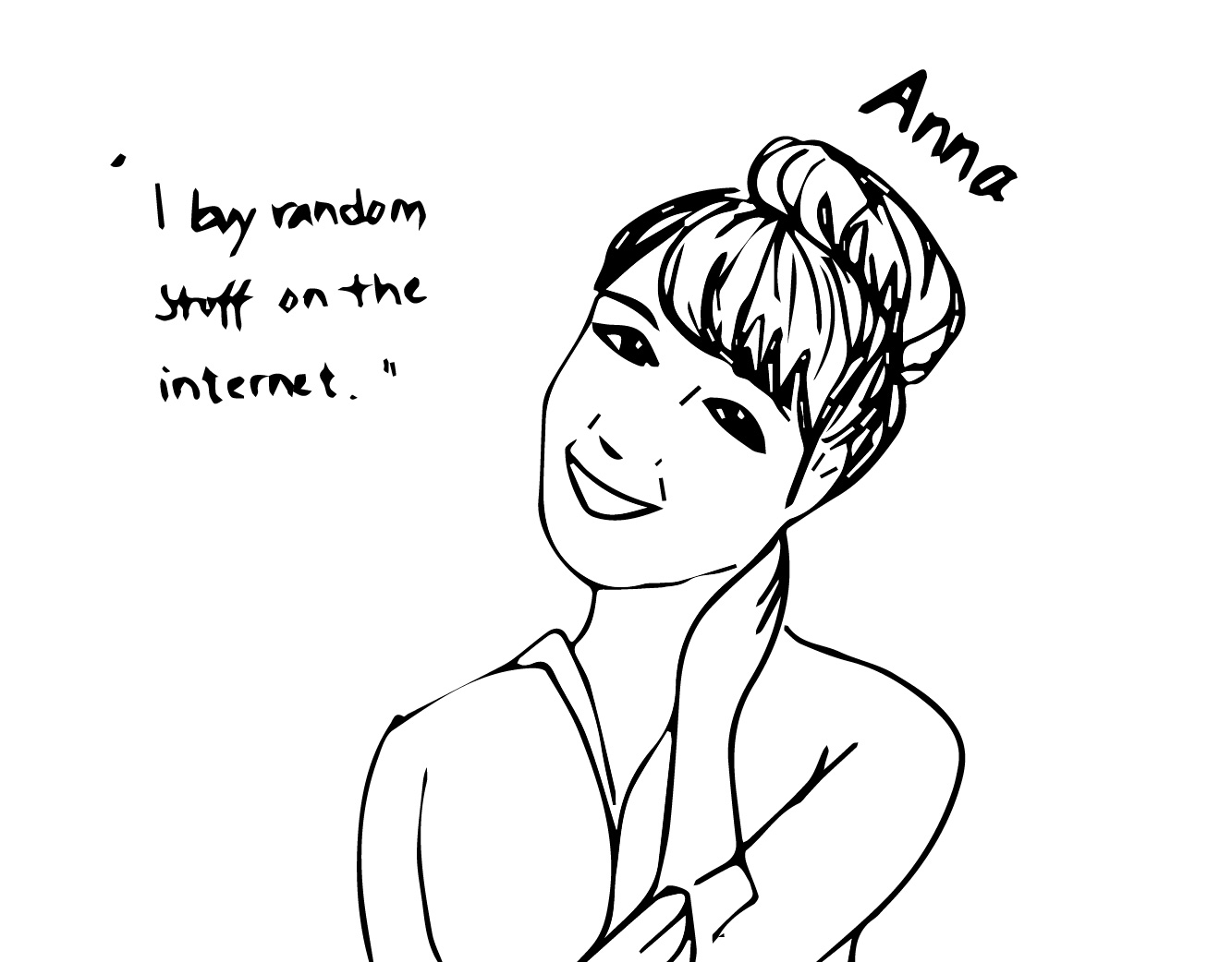
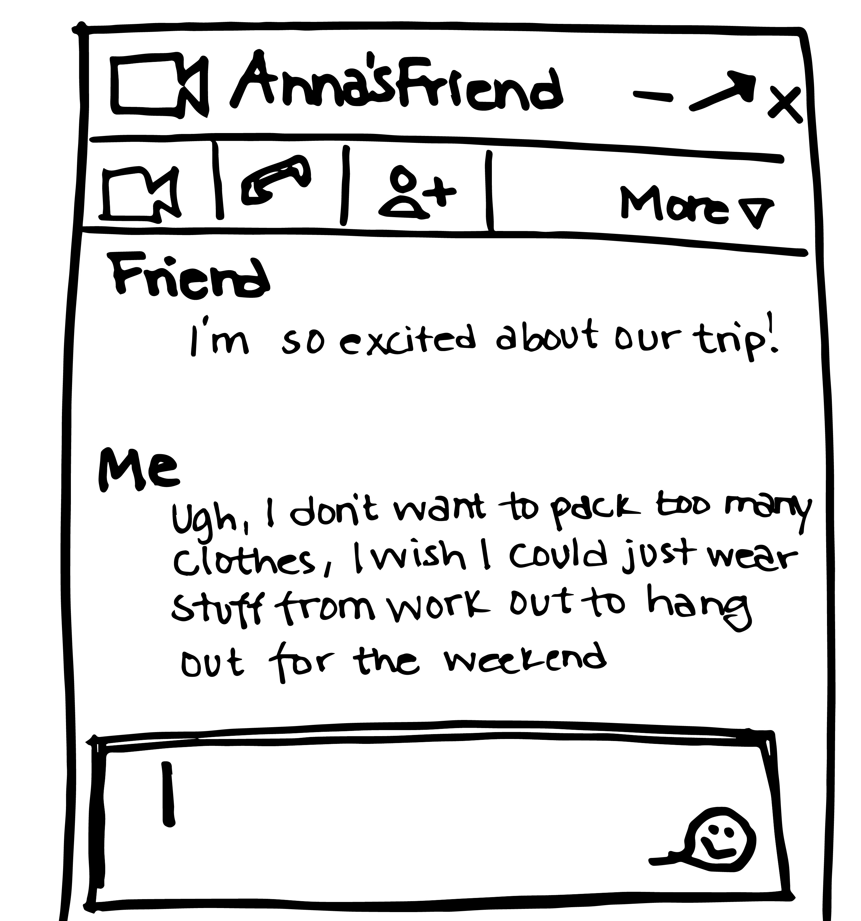
ANNA (taken from the brief)

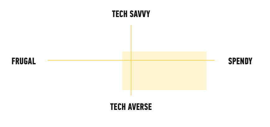
FAVORITE THINGS
Lululemon, Juicing, Detoxing, Botanical Gardens, Floss, Bikram Yoga, The Barre Method, Orbit Gum, Chia Seeds, Toyota Prius, Smartpop, Organic Dark Chocolate..."STORYBOARD
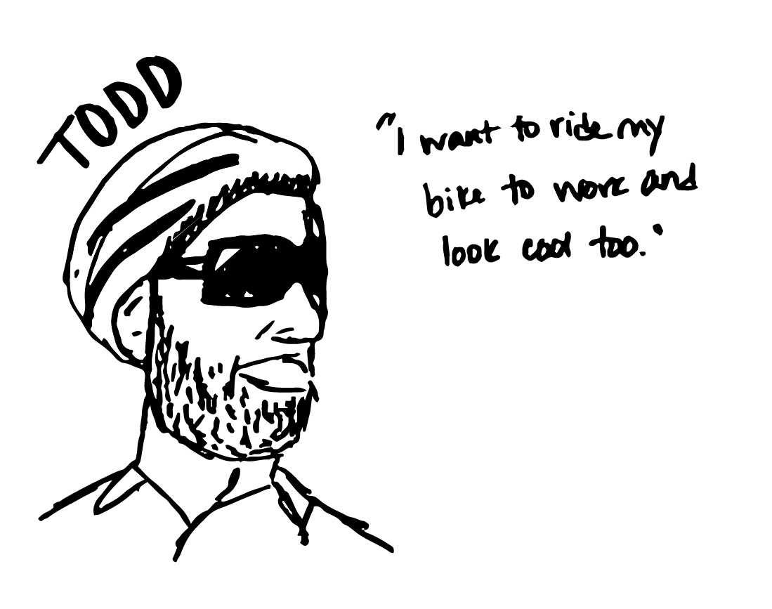
TODD (taken from the brief)
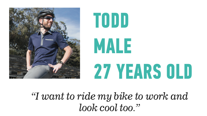
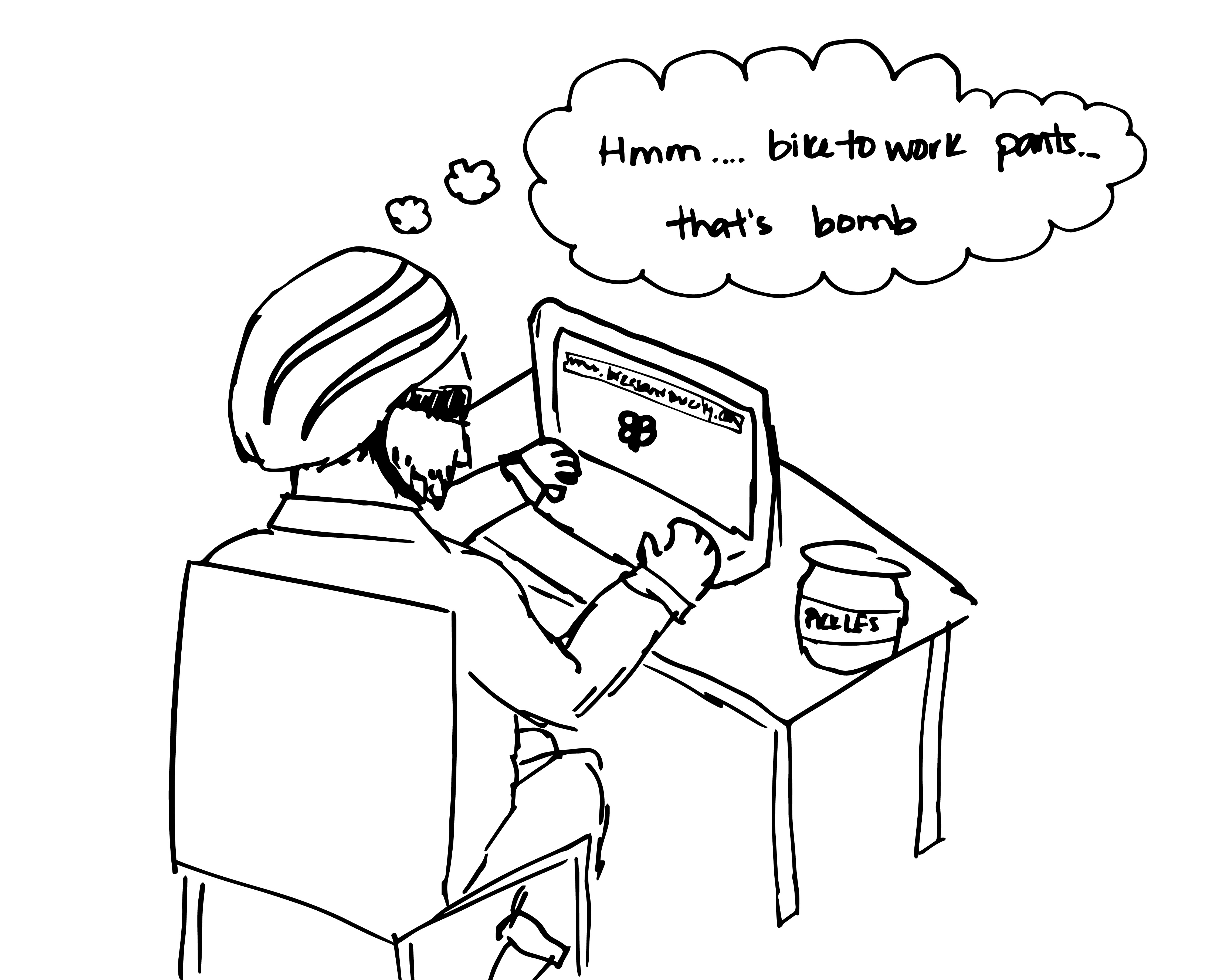
 "Todd, a 27 year old Rails developer at an SF startup is an avid cyclist. When it comes to looks, he's equal parts interested in form and function and he tries to invest in pieces of clothing that support his active lifestyle. His girlfriend describes him as "hipster-lite with an emphasis on ironic sense of humor". He also really likes to support local brands, especially if he hears about them on the many cycling blogs he scans during the week. He's in the market for a new pair of pants, reads about BetaBrand on www.bikesandthecity.com and decides to explore the site.
FAVORITE THINGS
PBR, Star Wars, Pickles, Free T-Shirts, Instagram, Snark, Oakleys, Coding Meetups, MVC Frameworks, Halls, Mountain Dew, Traveling, Overpriced Pizza..."
STORYBOARD
FAVORITE THINGS
PBR, Star Wars, Pickles, Free T-Shirts, Instagram, Snark, Oakleys, Coding Meetups, MVC Frameworks, Halls, Mountain Dew, Traveling, Overpriced Pizza..."STORYBOARD
Competitive Analysis
I analyzed, and compared these e-commerce and funding platforms:
- Kickstarter
- IndieGoGo
- Urban Outfitters
- ModCloth
- H&M
- Alite
- Threadless
- Benny Gold
- Bonobos
- San Franpsycho
- Moosejaw
Aside from a general understanding of information architecture, I took some key features away from other websites.
MODCLOTH
Bonobos
Urban Outfitters
Sitemap
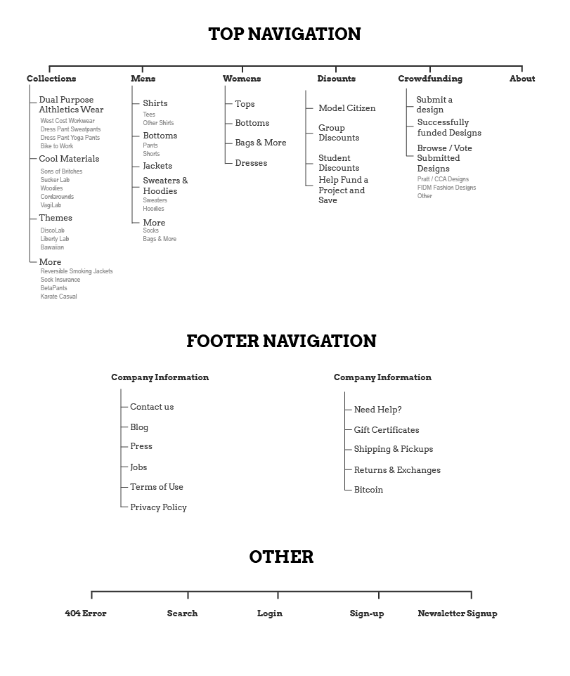
The largest problem that Betabrand was facing was the enormous and confusing navigation.
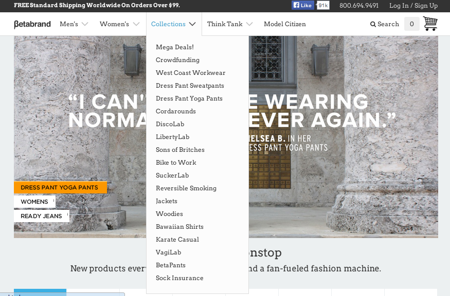
I proposed categorizing things into smaller chunks. Here is my suggestion for the sitemap and navigation scheme.
Final Design
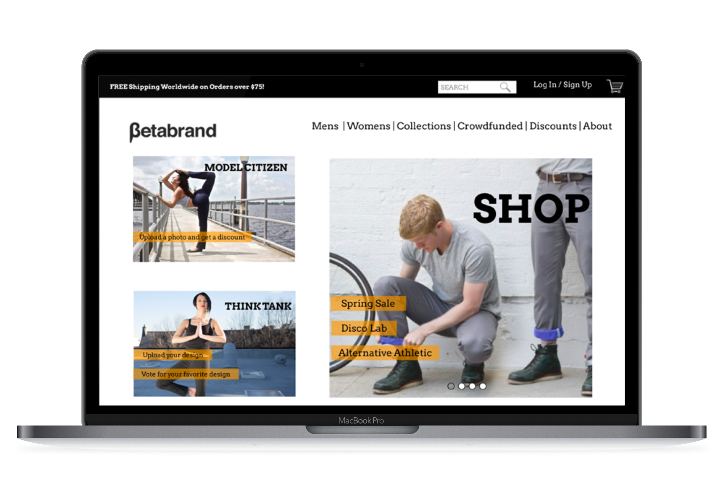
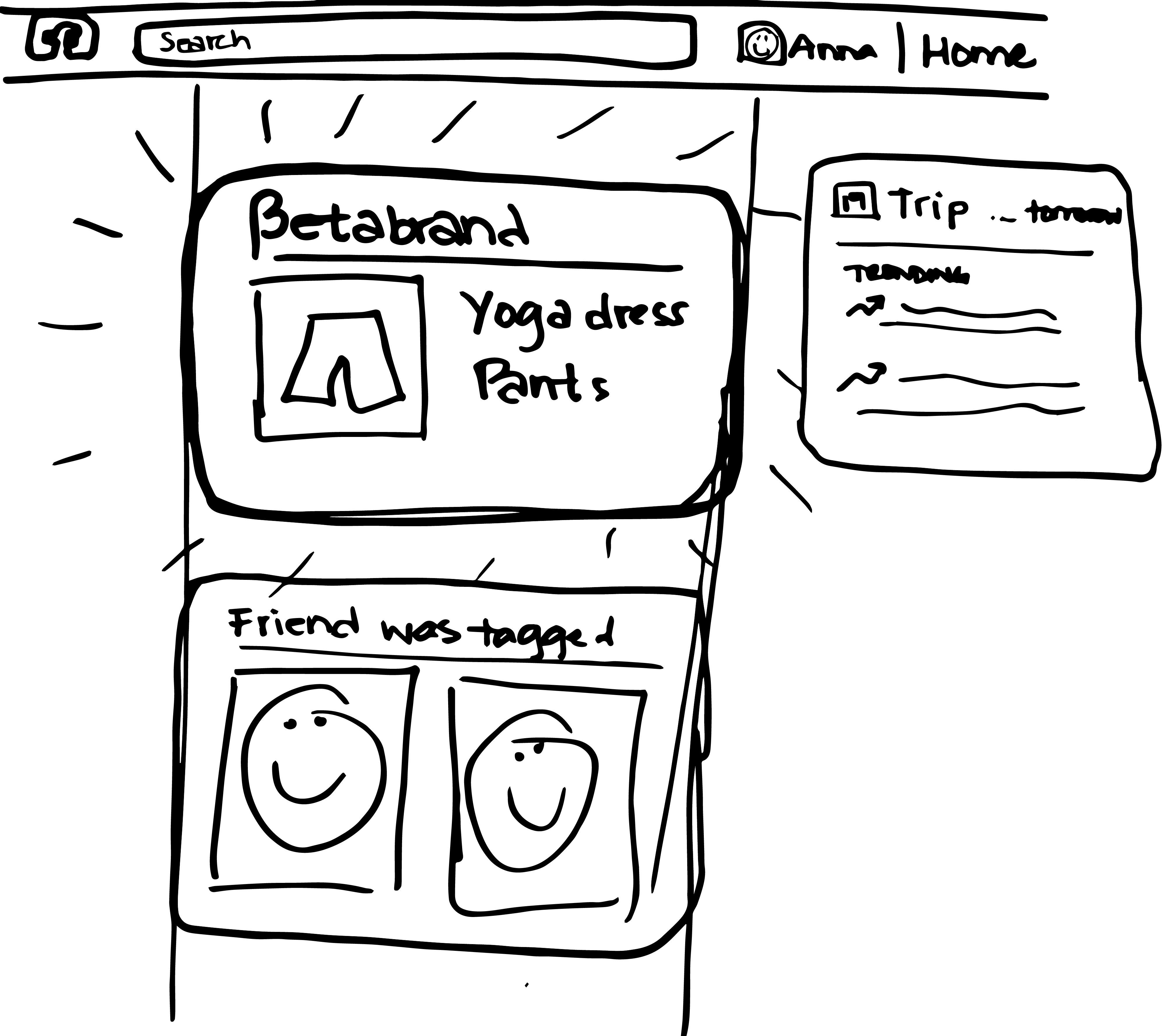
HOMEPAGE
Betabrand's current home page

I redesigned the homepage to:
- Be smaller
- Have a fixed footer
- Show what Betabrand is, and why it's interesting
- Make the available actions on the site evident
- Highlight the information and actions that Betabrand wanted to be evident
- Shorten the navigation
- Decrease load time by having less things on the page at a time
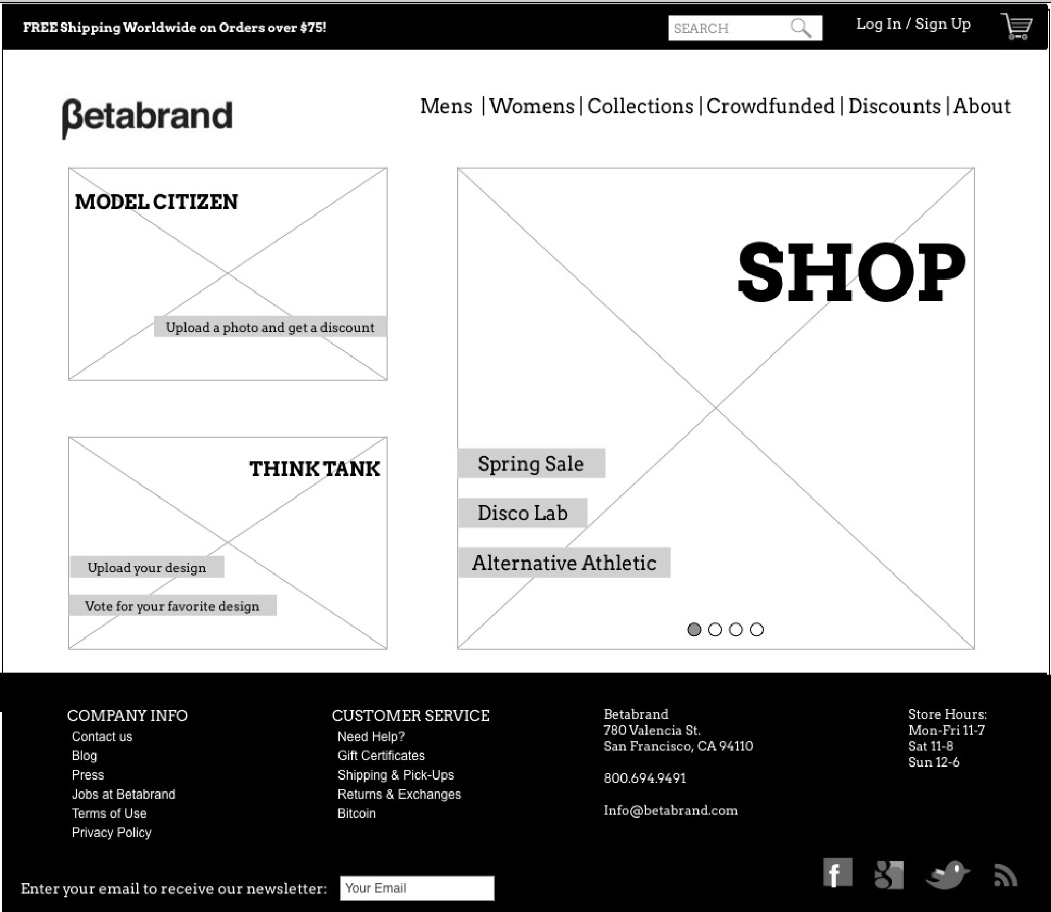
One of the current website's strengths is the interesting pictures that illustrate the important features of the brand, so I wanted to make sure the homepage still focused on those images, but also made it easier to find information and functions of the website.
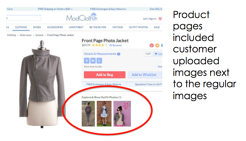
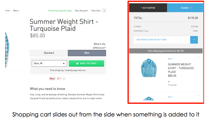
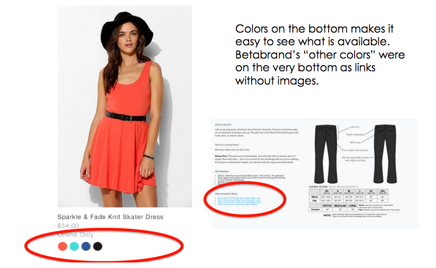
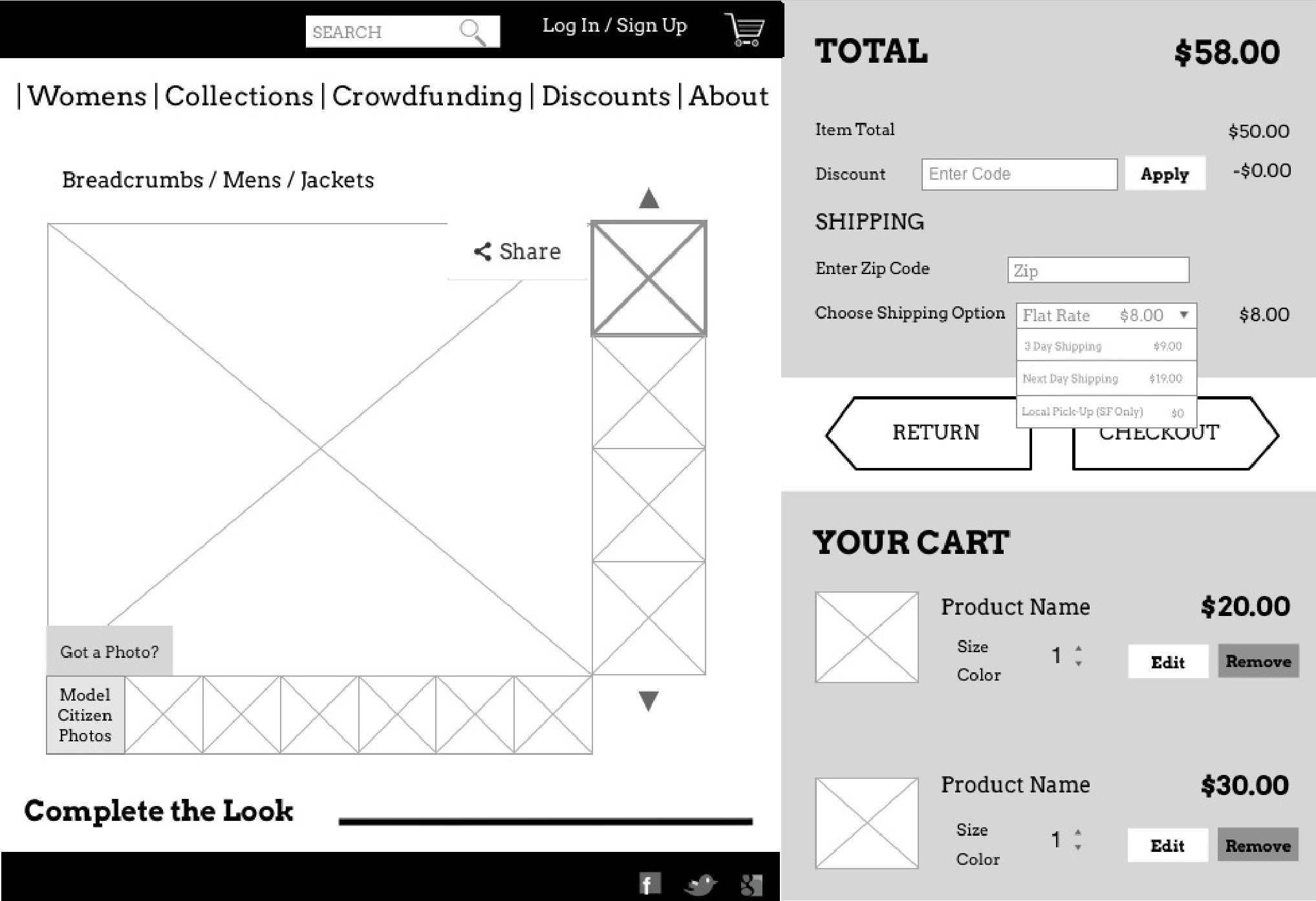
PRODUCT PAGE
I designed the product page to...
- Show the other available colors on the page
- Show the customer photos on the page, as well as make it easier to upload your customer photos
- Make the alternative pictures of the item more evident
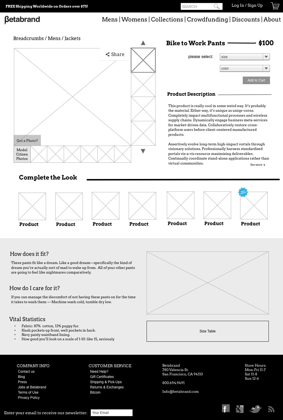
The cart slides out from the side when something is added to it. I also put the shipping calculator inline, so customers could see their cart total before they buy.
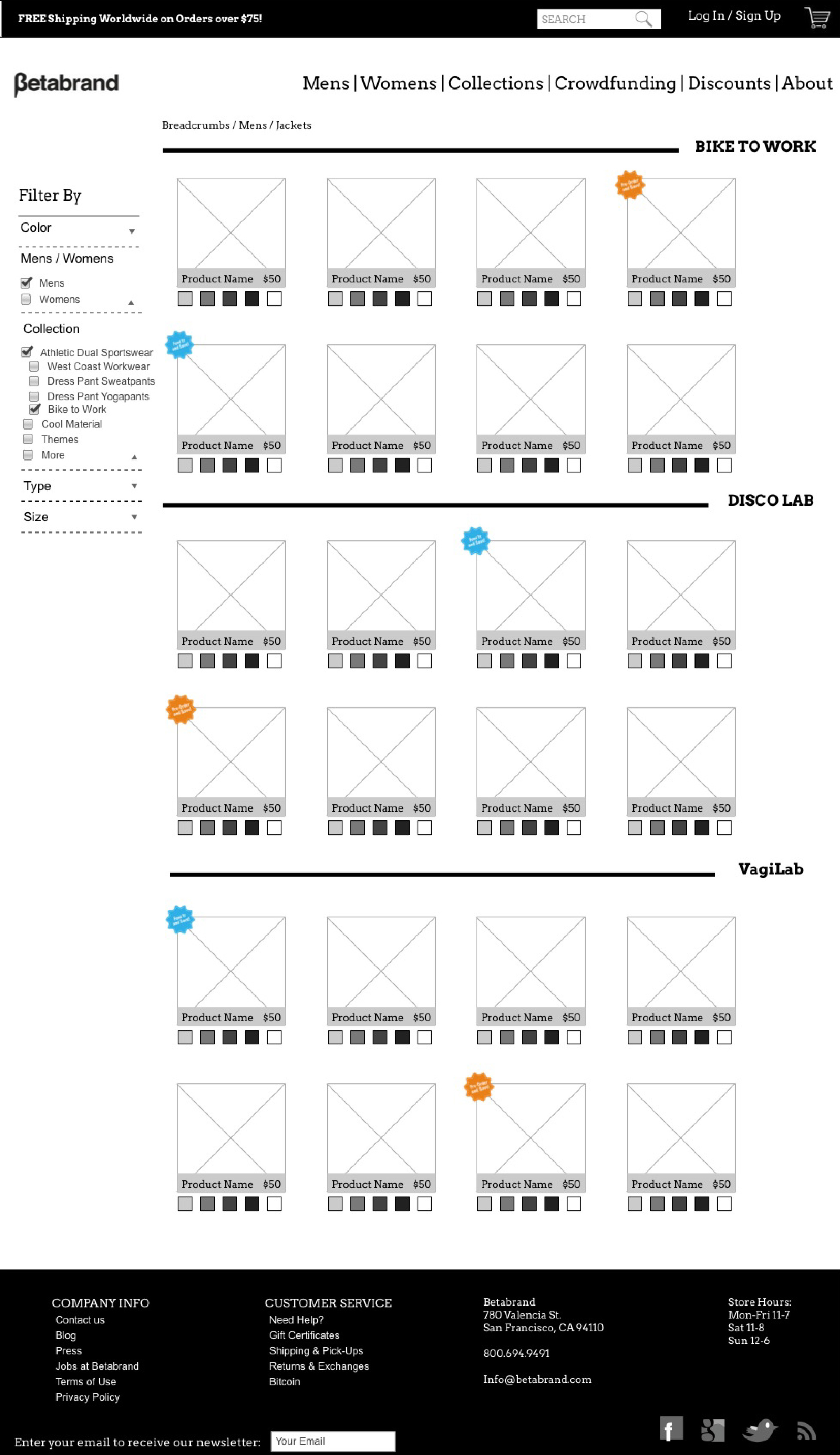
PRODUCT CATEGORIES PAGE
I designed the product categories page to...
- Show colors on each product
- Be more condensed
- Have a filter
This is Betabrand's current page:
And my redesign:
Once again, the clickable prototype can be viewed here