FIELD RECRUITING APP
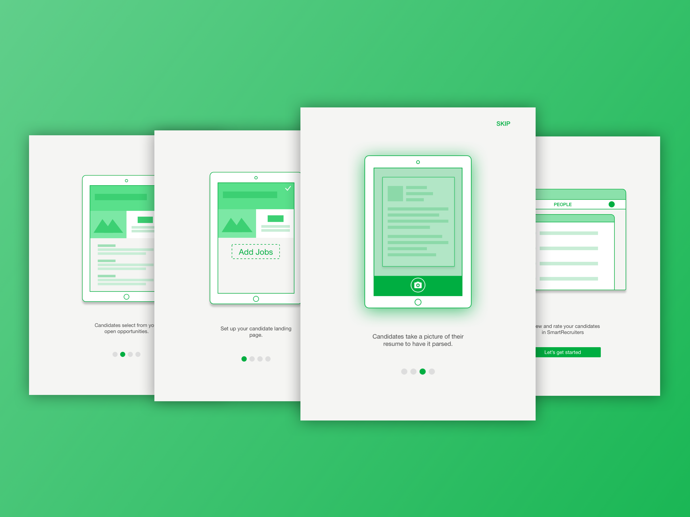
App onboarding screens
The Field Recruiting App (affectionately known internally as ‘the FRAPP’) is an app that allows users to capture candidates’ resumes offline. The typical persona for this app would be a recruiter at a job fair or university recruiting event, or a retail store manager taking applications at a specific location. The app was designed and built in Android and iOS.
I worked on this project in late 2016 with our mobile team (one iOS developer, an Android developer, and our product manager). The idea came from an internal hackathon, during which the team created a way to take a picture of a resume and parse the information into the core app.
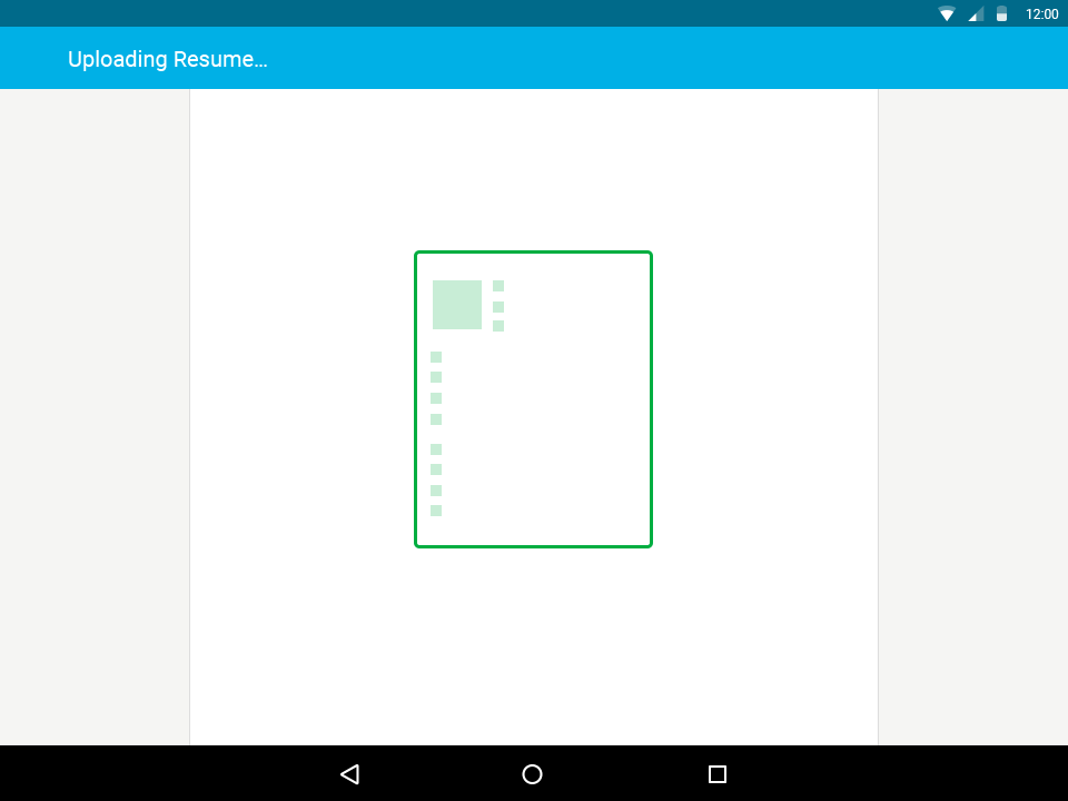
Resume parsing state
Initial Research
We began our research by conducting contextual inquiries. The product manager (Kelly Fang) and I went to a job fair, and spoke with the recruiters and the candidates to discern what the pains and complications were with the process, as well as understand whether our app would be useful to them. The idea was indeed well-received, and would be solving various issues for them.
We also spoke with some of our customers about their pains, and how they might use the app. One of our companies, Alaska Airlines, relies heavily on job fairs to draw in potential pilots and flight attendants into their talent pool. Other companies would use the app to take applications in-store instead of directing their candidates to apply online.
As far as we could find, there are no other apps that perform this specific function, so our competitive analysis was directed towards apps that have a similar interaction in that they have an employee flow and a customer flow. We looked at sign-in apps like Envoy, check-out apps like Square, and even in-store help apps like the ones at Target.
Mobile versions of android and iOS
Problems Identified
From our conversations with users and potential users, we were able to identify some key problems we could solve with the FRAPP.
- At the end of the job fair, recruiters have stacks of physical resumes that they have to sort through and input into their ATS (applicant tracking system). This is tedious and time-consuming. Most don’t actually put any of the resume information into the ATS, just the names of the candidates. The only way they can tell them apart is by the notes they physically scrawl on the resumes (if they have time).
- In stores, hiring managers will receive lots of resumes as well, and they will have to go through a similar pains of sorting through and inputting resumes into their ATS.
- Each resume not only needs to be submitted, but given a specific source, and put into the right job. For example, a user will want to be able to reference all the candidates they found at a particular job fair by filtering by the source “University of Michigan Business School Job Fair.”
- Candidates carry around paper resumes and if they were to take the time to input a lot of information into a form, there would quickly be a hold-up at the booth.
Prototyping & Testing
I began by creating a paper and pen wireframe that I put into a prototype. From the conversations we had, we knew that this app would be primarily used on a tablet. Because of this, I created the prototype in a tablet size and tested it on an iPad.
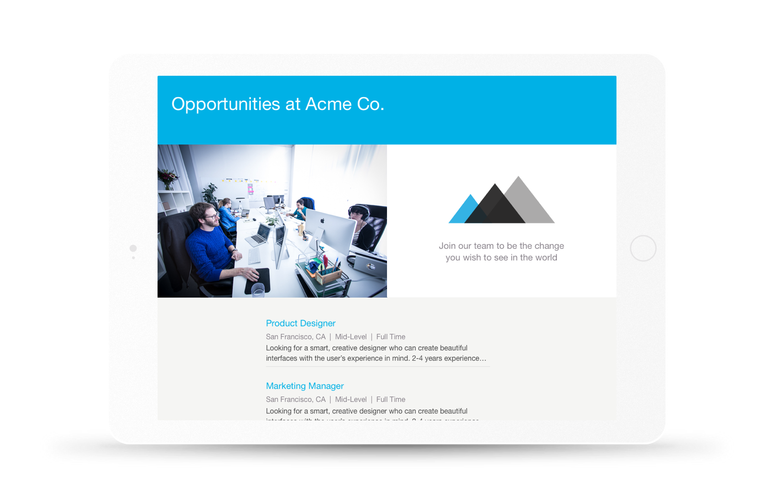
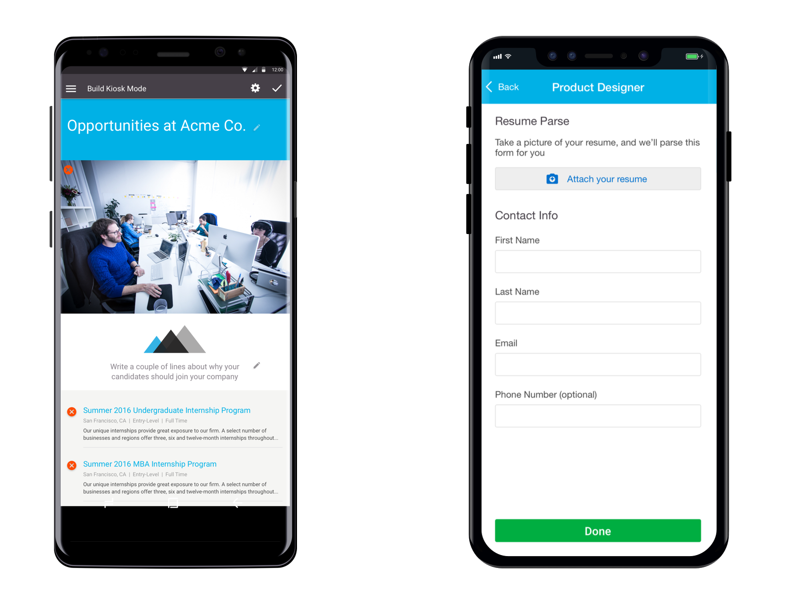
The solution was to create two flows; one for internal users to set up which jobs, source, and brand they wanted prospective candidates to see (kiosk mode), and one for candidates to quickly submit their resumes.
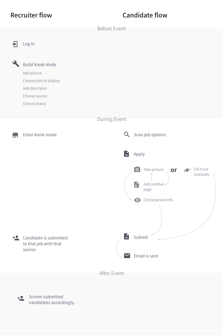
Flow of recruiter and candidate before, during, and after the event.
The product manager and I tested this prototype internally, and once we refined the flows we were faced with a few more questions:
- What is the best way for users to be able to exit kiosk mode?
- How do users set up the interface for the candidate?
- What if the candidate doesn’t have a resume?
- How can we allow recruiters to make notations on resumes?
With these questions in hand, we returned to users with a higher fidelity prototype to test and understand their needs better.
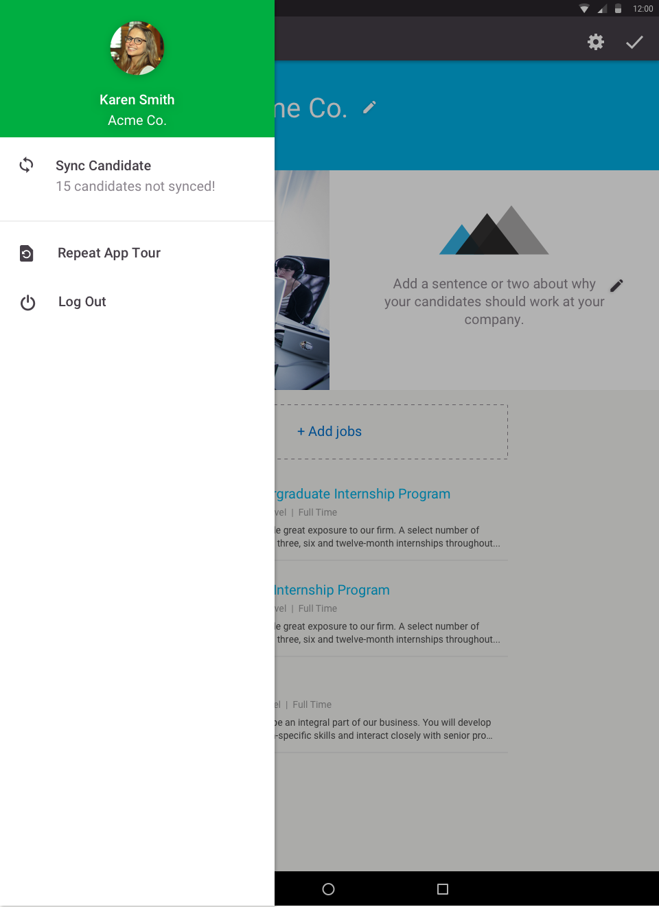
UNLOCKING KIOSK MODE
We tested several methods for unlocking kiosk mode and getting back to build mode including:
- A code system that would allow the user to create a personal code that would be emailed to them as a reminder.
- Simply hiding the “exit kiosk button” in at the end of the jobs list.
- Having a specific touch gesture.
The touch option seemed the most secure and simple, so we went with that.
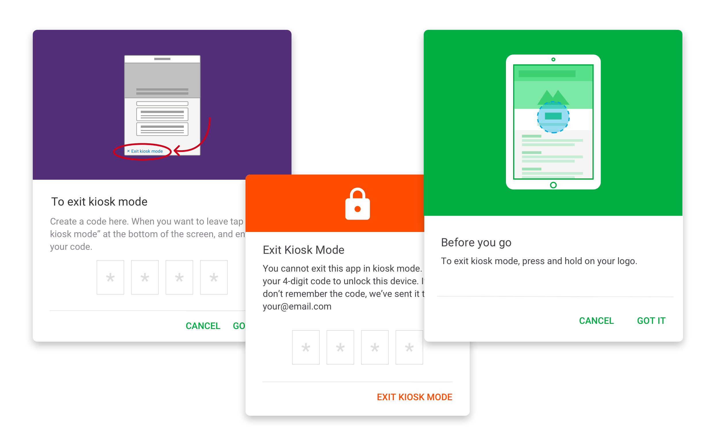
Options for exiting kiosk mode
SETTING UP THE INTERFACE FOR CANDIDATES
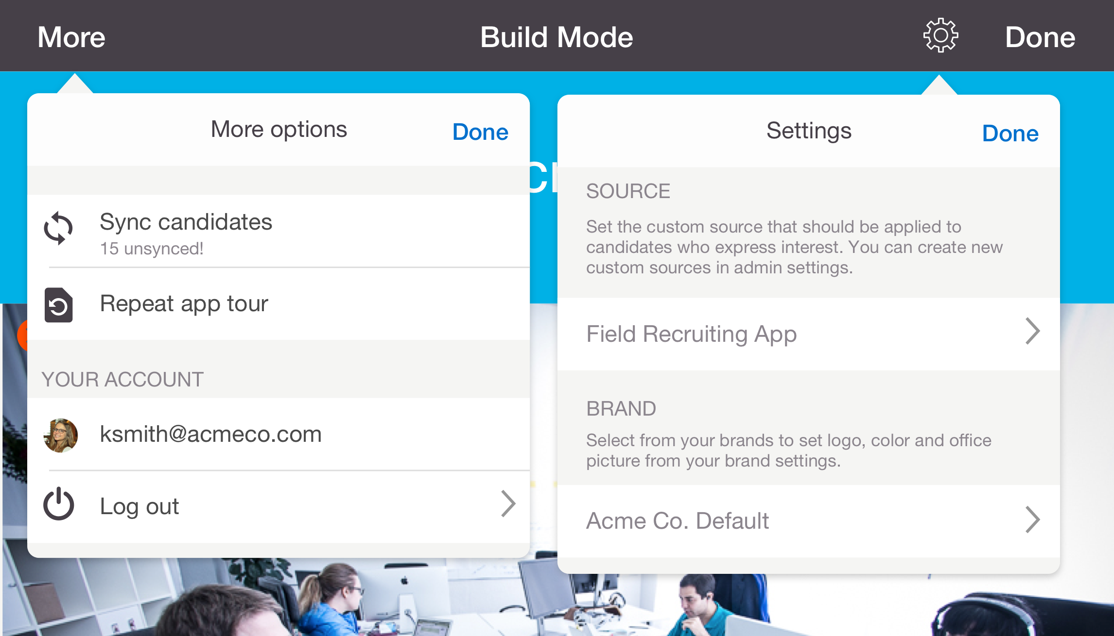
"Build mode" on iOS
From our talks with users, we determined that they needed to specify these three things:
- Specific brand (and associated logo, colors, etc)
- Jobs
- Custom source
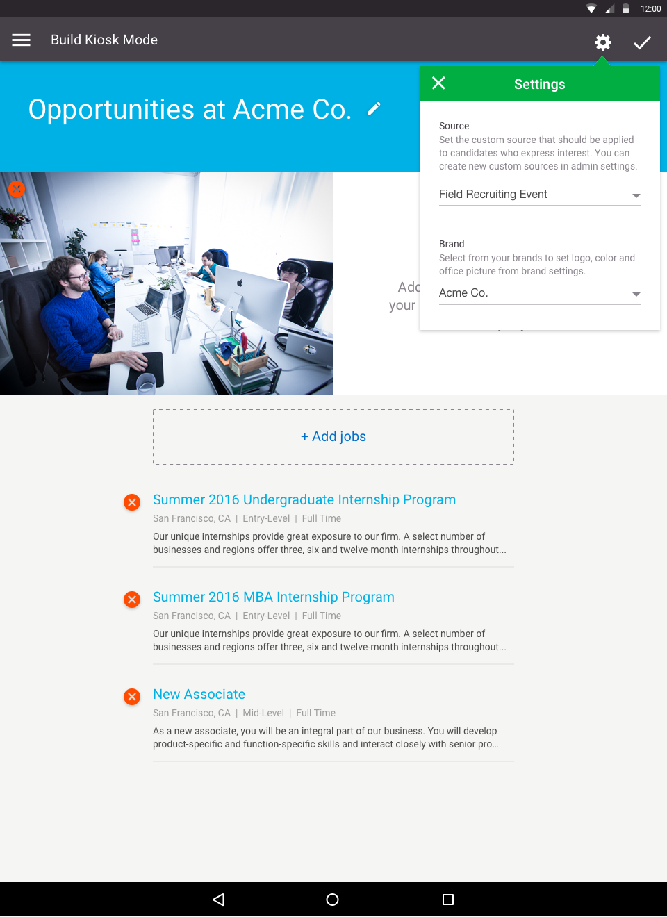
"Build mode" on Android
CANDIDATE APPLICATION FLOW
As we found during our interviews, not all candidates have resumes. This meant that we had to create a super-quick alternate experience for these users.
Candidate application flow
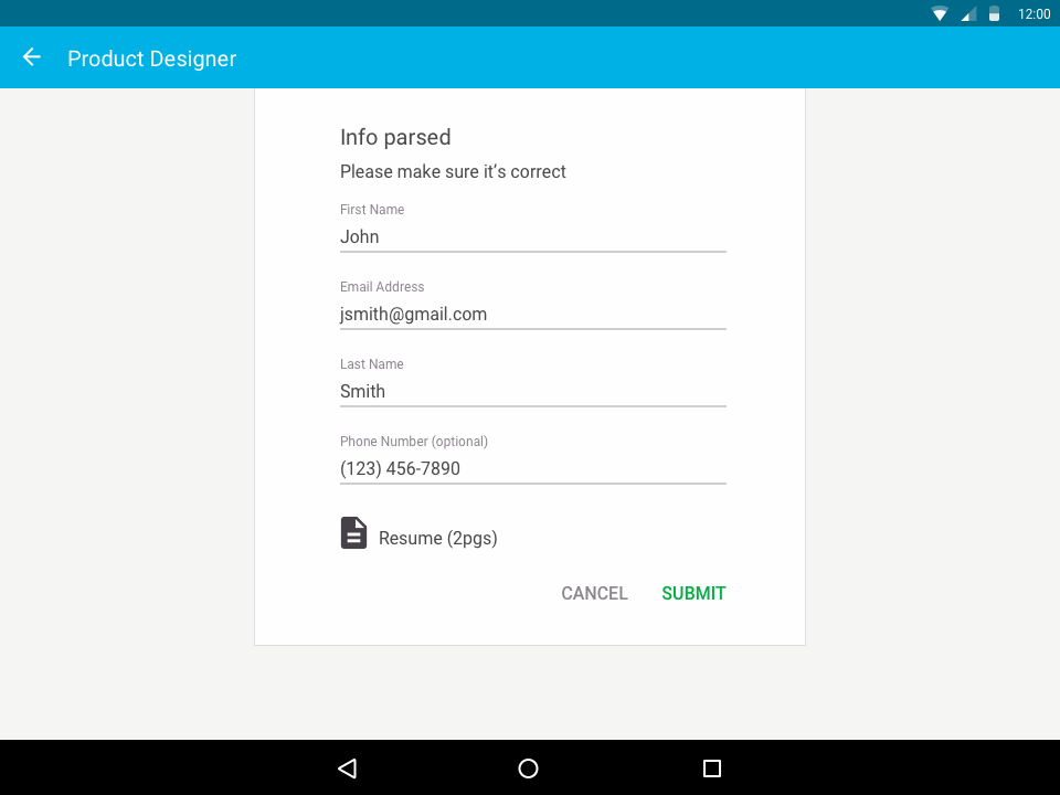
Successful parsing on Android landscape view
NOTATIONS ON RESUMES
During our contextual interviews, we found that recruiters will typically write a note in the white space of a candidate’s resume to be able to remember them when they sort through the pile later. We considered many options on how we could do this using the app, but realized the format simply wasn’t conducive to that. The candidate would have to hand the app back and forth, and the flow of information would be lost.
Luckily, there is already a way to do this using the companion app. As the candidates are coming in, they will show up inside the app, and recruiters can take notes there if they talk to a candidate they want to keep track of.
Visual Design & Branding
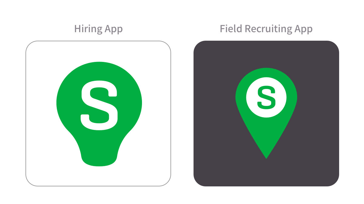
With the flows sorted out, I moved on to the visual design and branding of the app. It needed it’s own logo and style that would make it seem like part of a suite, but also a separate app.
In general, I kept the styles closely aligned to Google’s Material Design guidelines and Apple’s Human Interface Guidelines. I kept our bright brand green, and chose a deep purple to compliment it.
I also designed an icon for it. I went through several iterations, focusing on the “field” aspect of it.
In the end, the team opted to go with a simple option that is similar to the companion app.
Conclusion
The end result is a simple experience for setting up a quick job list landing page, and a simple apply. We demoed the application flow at our first annual Hiring Success Conference in April of 2016.