LEELANAU TRADING COMPANY
Summary
This project was a complete redesign of the e-commerce platform for the Leelanau Trading Co.
The Leelanau Trading Co. is the company that my parents started in 1994. It is an American-made company that manufactures hand made leather and wood bags, luggage and journals, as well as provides customization for menus and corporate gifts. The products have been featured in Urban Outfitters, Lands End, Starbucks, Cabelas, and many boutiques around the world.
First Redesign
Most of the business for the Leelanau Trading Co. is currently wholesale, partly because the previous website had not been updated since its creation (in the late 90’s), and not easy to use. Customers often called to complain about how they couldn’t navigate the site and how the pictures were out of date, and not all the products were available. It was also a bit of an eye-sore with its outdated graphics, and tiny font. The products are so beautiful, and made with so much care, it seemed unfair that they should have such an unattractive home online.
You can see for yourself what I mean:
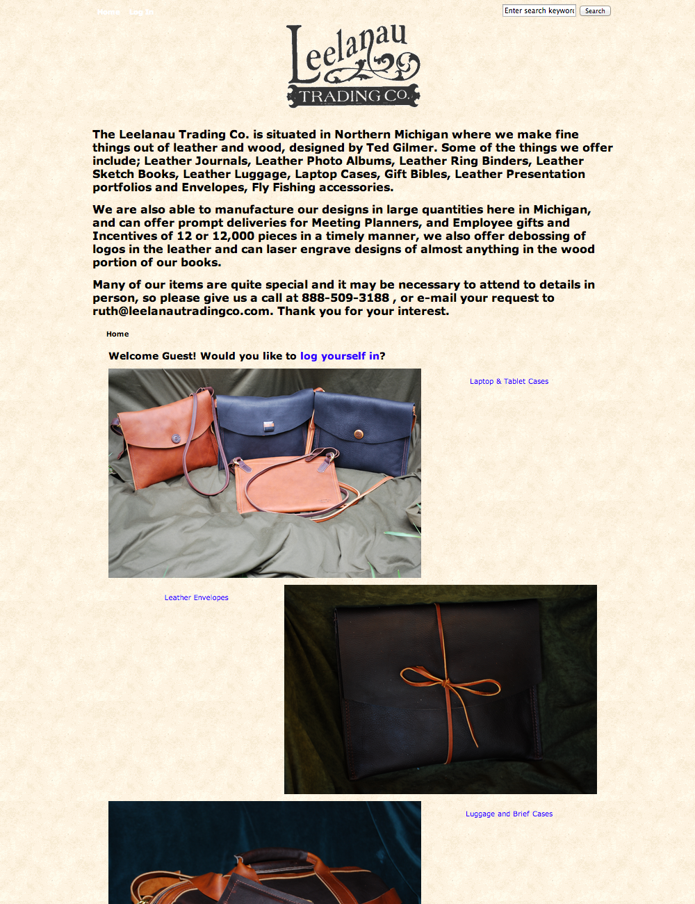
I first created a WordPress e-commerce website with WooCommerce and the Avada theme to house the products, installed necessary plugins, created the aesthetic of the site through the options in the theme, created the graphics for the banners in Illustrator, edited the product photos in Photoshop, and wrote the product descriptions.
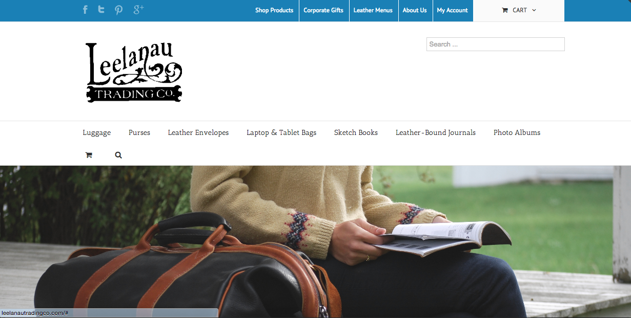
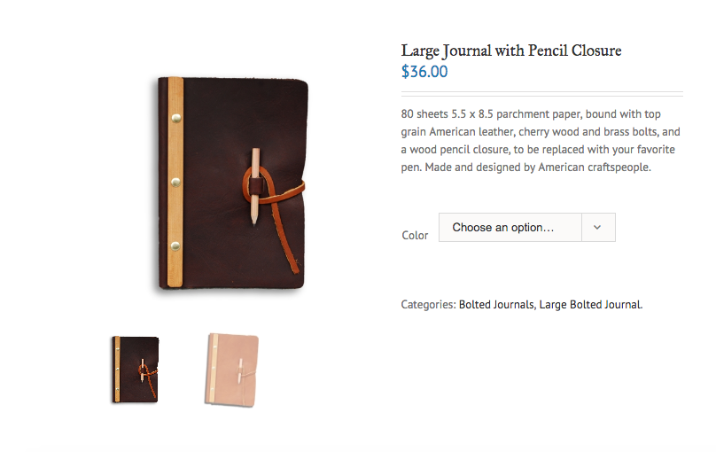
This definitely improved the overall look and usability of the site, and has been steadily increasing online sales. However, I have found that there are still very “wonky” sections to this website that make it very difficult to use, and are most likely inhibiting users from having a great experience. For example on the product page, it’s not at all obvious how the user is supposed to add this item to his or her cart (you have to chose a color first).
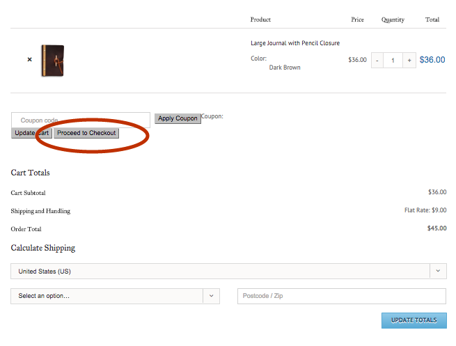
Also, in the checkout flow, it the “proceed to checkout” button is grey, not very noticeable, and looks the same as the rest of the buttons...except for that big blue button that is not the main call to action on the page.
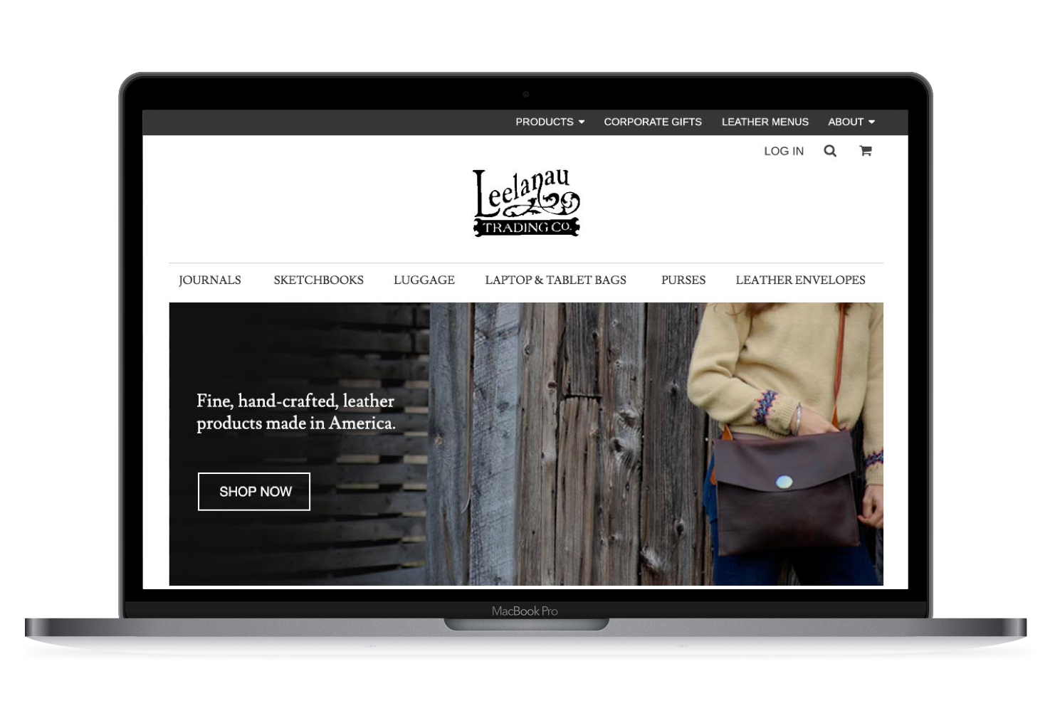
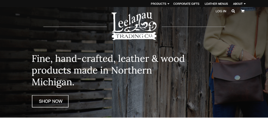
Second Redesign
As the manager of this website, I can tell that there are lots of improvements that can be made not just from a UX/UI standpoint but also editing the code for improved SEO. An e-commerce website needs to accurately display the brand, be found easily through searches, and make it as simple as possible to purchase items.
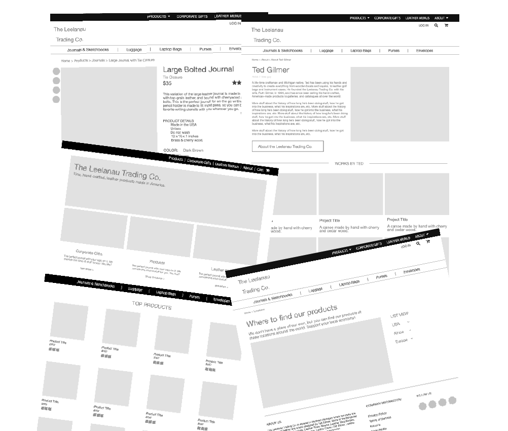
Because I was in-between projects, I began to redesign this site from scratch. I’m currently working on the wireframes and UI, and will begin coding soon. I will be coding the website using PHP (which is what I used for this portfolio site), and integrating it with Wordpress.
I began by mapping out the options and card-sorting to create the organization and navigation of the site. The website is not only for e-commerce, it must provide information for the wholesale side of the business (which is currently the bulk of sales). This includes selling to other stores, corporate gifts, and custom menus. I chose create two different menus for this reason.
One menu--at the top of the page--would be for the site overall. It has information on the company, corporate gifts, menus, and products. “Wholesale” is not directly stated because that business is acquired in other ways. The secondary menu is all about the products -- listing the types (purses, luggage, journals etc.) so that users could easily navigate as well as see at a glance what the website offers.
Similarly, I created a large section above the fold showing the products, with some text speaking to the American-made, and homespun nature of the products, and the two smaller photos beneath it offer a short description of the corporate gifts and menus. Beneath these banner photos are the products categorized by type. I put the most popular classification of items in the top row.

Another consideration for this site is that it not only has to be usable and professional but also retain a hand-made quality because the products are mainly sold in boutiques.
I’m currently working out the final “look” of the site, translating the wireframes to mockups (using photoshop for both), and designing the mobile version of the site.
 Clickable prototype
Check back for updates!